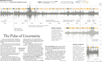
2007 may have felt volatile, but it was an average year at most. The New York Times looked at volatility over the last 100+ years. If you want to see what volatility looks like, look at the chart on the Shanghai composite. You can click on the picture to go to the NY Times Article.
Monday, January 7, 2008
Nice graphic on volatility
Labels: Stocks
Subscribe to:
Post Comments (Atom)


No comments:
Post a Comment